Are you in search of a few About Me page examples to use as inspiration for your own personal brand and business website?
Most bloggers and businesses add an image and a few paragraphs.
But, you can do better than a simple design like this.
In this post, you’ll find real-life examples of creative About Me pages. We’ll be taking a look at what works and what doesn’t work for each one.
You’ll also find some extra tips towards the end of this post – use these to create a fantastic About page for your own blog.
Let’s get into it.
The best About Me page examples
Here’s a quick rundown of the pages we’ll be taking a look at:
- The High-End Design: Wit & Delight
- The Business Card: Jimmy Viquez
- The Instruction Manual: FoodieCrush
- The Brand Summary: Clever Girl Finance
- The Blog Post: Nerd Fitness
- The Engaging Design: WePC
- The Scrapbook: The Blonde Abroad
1. The High-End Design: Wit & Delight
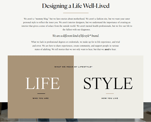
Wit & Delight is a lifestyle blog that began with one woman but has now grown to include an in-house team and dozens of contributors.
They have a blog and podcast and even offer digital marketing services to other lifestyle brands.
All of this is reflected on their About Us page, which features a stunning design.
It starts with a clever introduction that pinpoints exactly what kind of content Wit & Delight makes with descriptors like “we aren’t a “mommy blog,” but we have stories about motherhood. We aren’t a fashion site, but we want your outer personal style to reflect the inner you.”
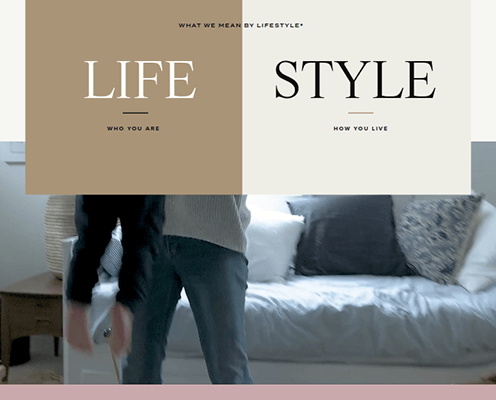
Part 2 has a three-section design that defines the brand’s core values, such as a split-screen box that briefly sums up what the term “lifestyle” in “lifestyle blog” means to them.
There’s also a parallax video of a mother playing with her child followed by a three-part, text-based slider that summarizes what Wit & Delight are.
Part 3 has three blog post suggestions on what to read first.
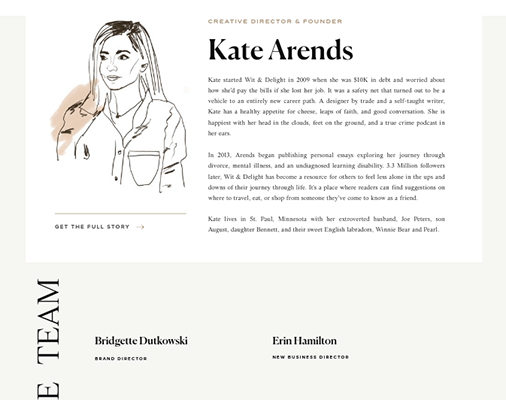
Part 4 showcases the brand’s team. This includes a dedicated section for Wit & Delight’s founder Kate Arends.
The two-row section includes an illustration of Kate on one side and details on how she started the blog on the other.
A grid layout lists other members of the Wit & Delight team after that.
Part 5 uses a split-screen slider design with text on one side and an image on the other. Unfortunately, this slider is a little futile as it simply reiterates the brand’s core values.
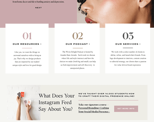
Part 6 is a simple section that consists of three cards that advertise three primary functions of Wit & Delight: the resources they offer, their podcast and their digital marketing services.
There’s also a call to action for their course on personal branding.
Wit & Delight highlight the blog’s other contributors and their social media profiles after that.
Why this page works:
- The high-end web design the page uses matches the brand’s stellar content while also captivating your attention.
- Defines the brand’s core values.
- Includes CTAs for products and services.
How this page can improve
- Remove ads. Promote your own products, services and content instead. Save ads for blog posts.
- Add images to the Team section.
- Use the slider in Part 5 for something else, such as reader stories.
2. The Business Card: Jimmy Viquez
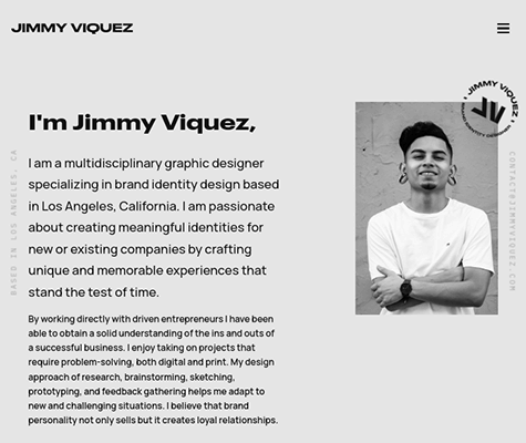
Jimmy Viquez is a freelance graphic designer based in Los Angeles, California.
His website is a gallery for client projects he’s worked on in the past as well as a hub for potential clients to learn more about his services.
In fact, that’s exactly what his About page does.
It only has four short parts, but they’re all effective at explaining the types of services Jimmy offers as well as the process he goes through to complete projects.
The most impressive aspect about this page is the absence of images.
It only has one—the image of Jimmy pictured above.
The rest of the page relies on typography for its design, but the design is so minimalist and the typography is so bold, it almost doesn’t matter.
After two short paragraphs that summarize Jimmy’s work as a graphic designer and the types of clients he typically works with, the page moves on to Part 2: Jimmy’s services.
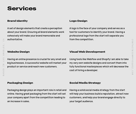
This section lists each service Jimmy offers to his clients and includes short blurbs about each one.
He could really enhance this section with small image examples of each service, but it’s a really smart addition to his About Me page nonetheless.
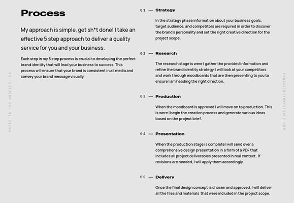
In Part 3, Jimmy lists the five-step process he goes through to complete client projects.
This is another clever addition to his About page. It answers many questions clients likely have during initial negotiations.
Jimmy concludes his About page with a simple call to action that encourages clients to get in touch for projects.
Why this page works
- Cuts to the chase by summarizing Jimmy’s services and process as a freelance graphic designer.
- Minimalist design with bold styles.
- Includes an impossible-to-miss CTA.
How this page can improve
- Include small images that depict each service being described in Part 2.
3. The Instruction Manual: FoodieCrush
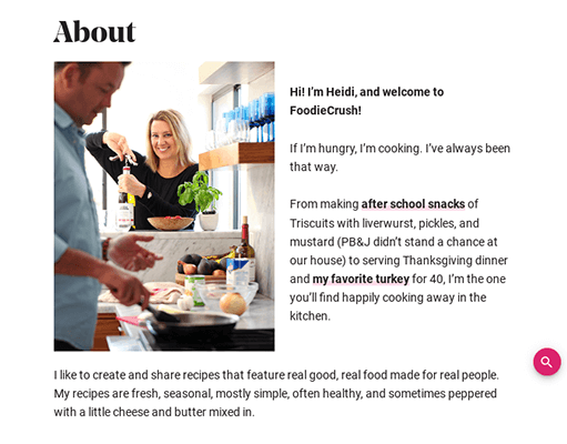
FoodieCrush is a popular food blog featuring recipes for all courses, all seasons and numerous cuisines.
It was founded by a blogger named Heidi, who still writes the majority of the blog’s content today.
The first part of FoodieCrush’s About Me page contains a few paragraphs that illustrate Heidi’s journey as a cook and how she uses those skills to craft recipes for the blog.
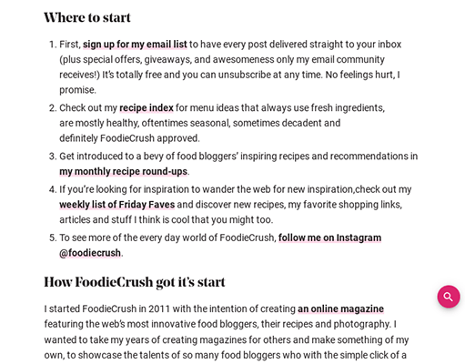
The second section of this page is what sets it apart from other blogs’ About Me pages, especially other food blogs.
It uses the heading “Where to Start” and contains a brief guide on how to use the FoodieCrush website.
Instructions include subscribing to the blog’s email list to stay up to date with Heidi’s latest recipes, checking out the recipe index, viewing a recipe roundup and reading Heidi’s weekly resource list.
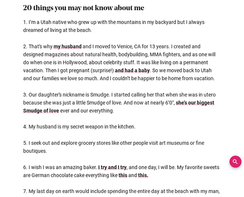
The next section illustrates the history of the blog and how it all started. It only uses a few paragraphs for this.
The section after that is another unique addition.
Heidi lists “20 things you may not know” about her in this section, some of which aren’t food related at all.
It’s a simple way to brighten up your About Me page and step away from the “salesmen” role for a bit.
Heidi uses bullet points to showcase where else on the web you can find her, such as her social media profiles.
Why this page works
- Simple and easy to digest.
- Includes instructions on how to use the site and find recipes.
- Includes a fun factoid list about the blog’s founder Heidi.
How this page can improve
- Remove the sidebar so the focus is on the content.
- Add more images.
- Make calls to action more prominent.
4. The Brand Summary: Clever Girl Finance
Clever Girl Finance is a financial media platform that publishes its content to a blog and podcast.
They also offer free online courses, books and one-on-one coaching.
Their About Us page is a five-part summary of their brand’s mission and what they teach.
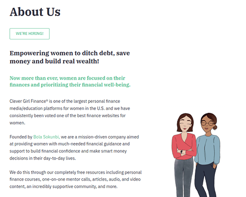
Part 1, pictured above, summarizes Clever Girl Finance’s core values and offerings as a whole.
This part starts with a well-written tagline that perfectly sums up the brand’s content: “Empowering women to ditch debt, save money and build real wealth!”
This summary is paired with an illustration of two women standing side by side.
At the bottom of this summary is a call to action to download the blog’s latest report on women’s finances.
Clever Girl Finance doesn’t use this as an opportunity to encourage you to subscribe to their email list, but this would be a perfect way to do so if you use this strategy on your own About Me page.
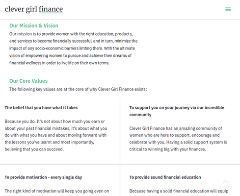
Part 2 lists the brand’s core values in detail.
They use a grid layout here with each value receiving its own space.
This is a great layout to use, and the blurb for each value is short and sweet. However, giving each one a small illustration, icon or image of some sort would really round this section out.
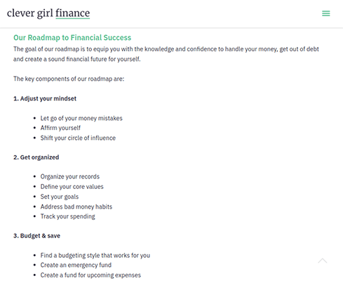
Part 3 is truly unique.
It’s a roadmap that’s more or less an itemized list of everything Clever Girl Finance helps its readers achieve when it comes to their own personal finances.
It’s also where this blog utilizes a call to action for their email list. At the bottom of the roadmap is a call to action website visitors can use to download an expanded version of the brand’s roadmap.
The next couple parts showcase Clever Girl Finance’s other brands and where they’ve been featured in the media.
Plus, if you’re not satisfied with how brand-focused this page is, if you hover over the About item in Clever Girl Finance’s navigation menu, you’ll see an option called Founder Story.
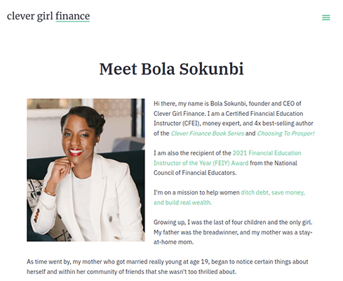
This leads to a page that tells founder Bola Sokunbi’s story about her own personal finances, her journey in the financial industry and how she started Clever Girl Finance.
Why this page works
- Summarizes everything the brand is about and how they can help you manage your finances.
- Includes calls to action in key sections.
- Follows the same color scheme and design elements as the rest of the website.
How this page can improve
- More images or illustrations.
- Include images and blurbs about the founder and contributors.
- Add a few reader testimonials.
- Improve CTAs with dedicated CTA boxes.
5. The Blog Post: Nerd Fitness
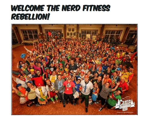
Nerd Fitness is a fitness blog with a very specific target audience: nerds!
They help “regular people lose weight and get stronger.”
The website has an active blog, but the company also offers a membership program, private coaching and a fitness camp.
You can learn all about what this unique fitness blog offers on their About page.
They treat it like another blog post, so it’s quite long. Therefore, we aren’t going to go over it section by section as we did with other About pages on this list.
We’ll cover the different headings the blog uses on this page instead.
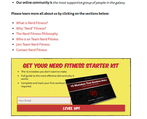
It starts with a four-part introduction. This includes a summary of Nerd Fitness, programs they offer, milestones they’ve achieved and a few links you can click to learn more about the company.
It also includes a CTA box to subscribe to their email list. This includes a fitness starter kit as an incentive.
The next section, which uses the heading “What is Nerd Fitness?”, is a long-winded explanation of how Steve Kamb founded the blog and how Nerd Fitness can help you achieve your fitness goals.
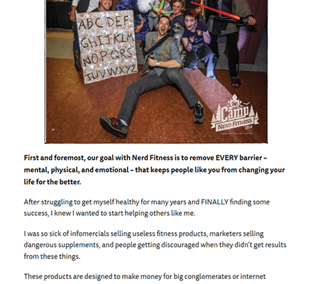
The highlight of this section is an image of a Nerd Fitness member’s transformation.
Not enough companies feature customer stories on their websites, let alone their About pages.
The bottom of this section features another CTA box that advertises a different resource kit.
The next section is called “Why Nerd Fitness?”
It’s short and features mostly text.
This section reiterates why Steve started Nerd Fitness, how the blog can help you become more physically active and why you should trust them.
Next up is a section called “The Nerd Fitness Training Philosophy”.
It covers what Nerd Fitness believes everyone needs to work on in order to reach their fitness goals: fitness, diet and mindset.
Each pillar has its own subheading and a brief explanation of why the blog feels they’re important.
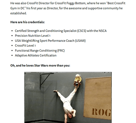
The next section introduces the team at Nerd Fitness outside of Steve Kamb.
It highlights a few higher-up team members and concludes with a group photo of the company’s fitness trainers.
The rest of the page focuses on various ways you can get in touch with the company, including positions they’re hiring for and what not to contact them about.
Why this page works
- Focuses more on how Nerd Fitness helps its readers and less on boasting about its own brand.
- Uses multiple CTAs to capture leads as potential customers.
- Includes reader stories.
- Although the page uses a blog post design, it features numerous web design elements to make it more readable, including bold text, multiple headings to break up text, short paragraphs and images.
How this page can improve
- Add more design elements to the page to make it more engaging.
6. The Engaging Design: WePC
WePC is a technology blog with a heavy focus on PCs, components and peripherals designed for gaming.
Their About page is fully-stocked with an explanation of the different types of content the company publishes to their blog as well as the team and process that gets it all done.
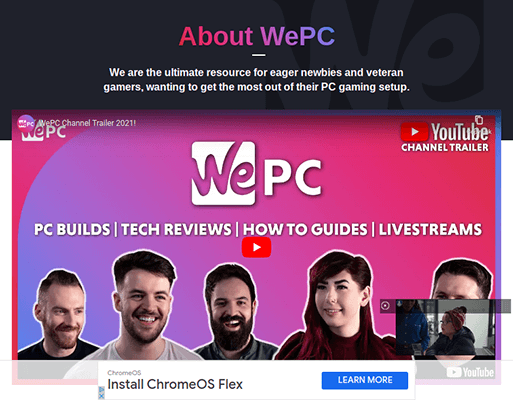
WePC also has a YouTube channel, so the first thing you’ll see when you view their About page is an embedded video of their channel trailer.
WePC doesn’t put too much time into their company history, but they do use this section well nonetheless.
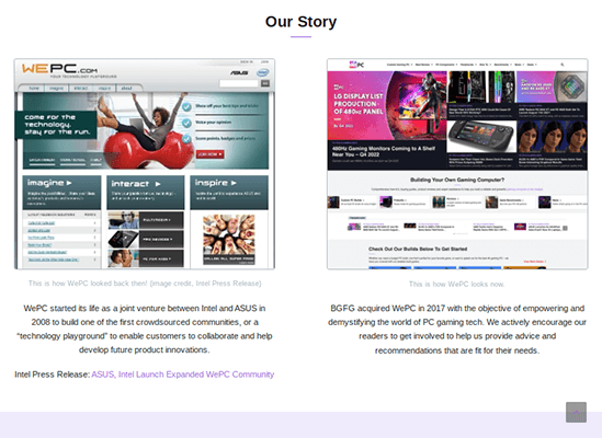
It features a two-column design with a screenshot of the way the website’s homepage looked when it launched in 2008 on the left and a more screenshot on the right.
Each image is accompanied by a short blurb depicting WePC’s history in a then-and-now writing style.
Next up is a clever section to add to your About page.
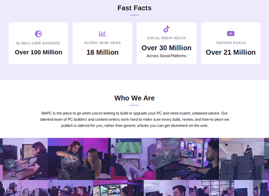
It features “fast facts” about WePC, which is really just a set of metrics of the company’s page views, social media reach and more.
This is followed by a short summary of the brand’s content and target audience.
The reason this section is a clever addition to an About page is simple: brands viewing the website will be able to see just how large the company’s audience really is as well as exactly who is in that audience.
Having this information readily available could potentially lead to more sponsorship deals as brands will know exactly how many eyes WePC can get their products in front of.
WePC also showcases logos of sites they’ve been featured on and includes a graphic representation of social media platforms they’re active on.
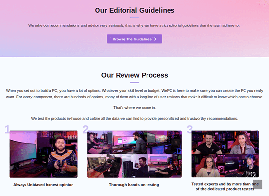
Next up is an explanation of the company’s editorial guidelines and review process.
It’s a multi-part explanation that gives a behind-the-scenes look at the care and hard work the blog puts into each and every product they review.
This is great for readers and potential sponsors alike.
It boosts trust among their audience and shows sponsors what to expect when they hand their product over for the blog to review.
WePC dedicates the rest of their page to their ever-expansive list of team members with a simple grid design.
Why this page works
- Engaging design makes the surplus of information featured on this page easier to digest.
- The “fast facts” section is a great opportunity to attract potential sponsors.
How this page can improve
- Remove ads to improve the design and performance of primary pages like the About page.
7. The Scrapbook: The Blonde Abroad
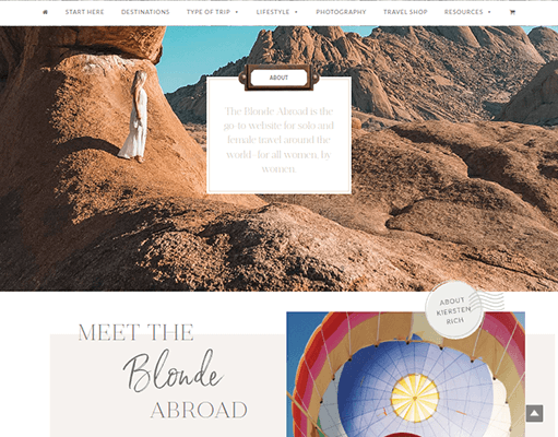
The Blonde Abroad is a personal travel blog where a woman, a blonde to be precise, named Kiki documents her adventures as she travels to different parts of the world.
Her About Me page has a scrapbook-like design that complements her content quite well.
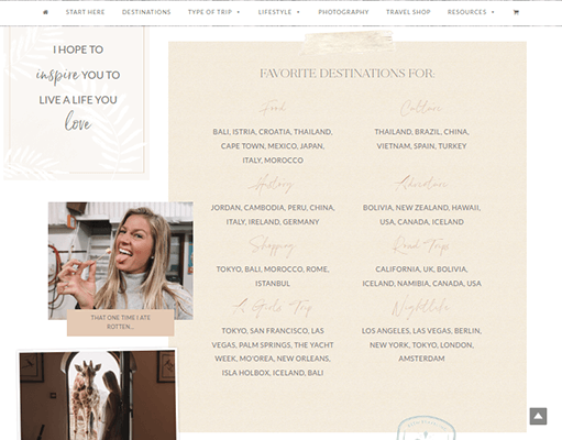
It mostly features images of herself in different destinations. The images come in various sizes, have borders and are fixated in different positions.
This gives Kiki’s About page a unique appearance as most websites showcase images in a level, 90-degree format.
Many of Kiki’s images, on the other hand, are displayed at different angles as if they’re part of a scrapbook or vision board.
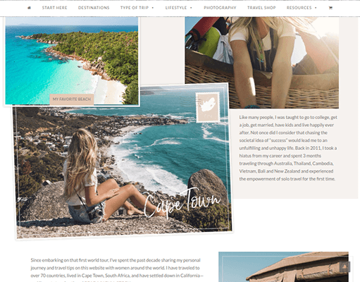
A few paragraphs here and there summarize Kiki’s travel journey and what she loves about traveling.
She also includes a two-part resource list where she names her favorite destinations for specific purposes, including food, beaches, photography, skiing, shopping, road trips and more.
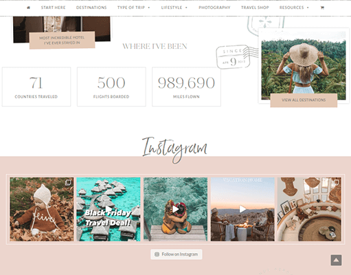
The page concludes with quick facts about Kiki’s travel journey, including a metric for the number of countries she’s traveled to.
This section also has a feed from Kiki’s Instagram profile.
Why this page works
- Relies heavily on imagery, a fitting design choice for a travel blog.
- Includes a resource list that demonstrates Kiki’s vast travel history while also providing quick-answers to frequent “where should I travel for [blank]” questions.
How this page can improve
- Better typography. Some fonts and color choices are hard to read.
- Include at least one CTA to capture leads.
Final thoughts + how to create your own about page
We hope this list of About Me page examples gave you plenty of inspiration for the design and content of your own About Me page.
Here’s a quick recap of design elements and content these pages included in case you need a mini resource list to refer to:
- Brand story with an emphasis on the founder’s story. It’s best to be brief with this.
- Team members and company culture. Include images and short blurbs, quotes or fun facts.
- Your blog’s mission statement. What kind of content do you create, how do you help your readers and what are your personal values?
- At least one CTA. Offer a lead magnet, and capture leads for your email list.
- Reader stories. Reach out to your readers, and ask if you can showcase their success stories and transformations on your website.
- Share insight into your business. This can include sharing details about your writing process, your workspace, etc.
- A lot of images. Stay away from stock images, though. Only use images of yourself, business or team, or use custom graphics tailor-made for your brand.
- Design elements that complement the information they’re meant to showcase. For instance, using big, bold letters for quotes or feature boxes for the different types of content/services you offer.
- Key metrics about your brand. Showcase your page views, your follower count across all social media platforms you’re active on, your engagement rates, etc. This information will encourage potential sponsors to reach out.
- “Start here” guidelines. A little section like this gives you a chance to point new readers in the right direction as far as your content and services go.
Also, consider what point of view works best for your About page: first or third person.
First is great for blogs and business websites that mainly revolve around a single individual. Use third person POV for websites with larger teams.
Pay special mind to your page title, but hide it on the page itself so it only appears in the browser tab.
Use “About Me” if you use first-person POV. Use “About Us” for third person. Also, include a tagline that summarizes your brand in a bold statement.
It helps to have goals in mind before you get started as well.
The About page is one of the most visited pages on a business or personal website, so it’s the perfect opportunity to achieve some of the mini goals you have for your blog.
Do you want to capture more leads and receive new customers?
Do you want to land more sponsorship deals?
Which products do you want to sell more of? Which blog posts need more page views or engagements?
The answers to these questions should have a profound impact on the type of content you add to your About page as well as the way you add them.
If you’re using WordPress, use a page builder like Thrive Architect or Elementor to get the job done. Gutenberg can work well but these plugins open up more advanced customization options.
Good luck!
