Be sure to cast your votes in the poll below; but first, let’s check out the box art designs themselves.
North America and Europe

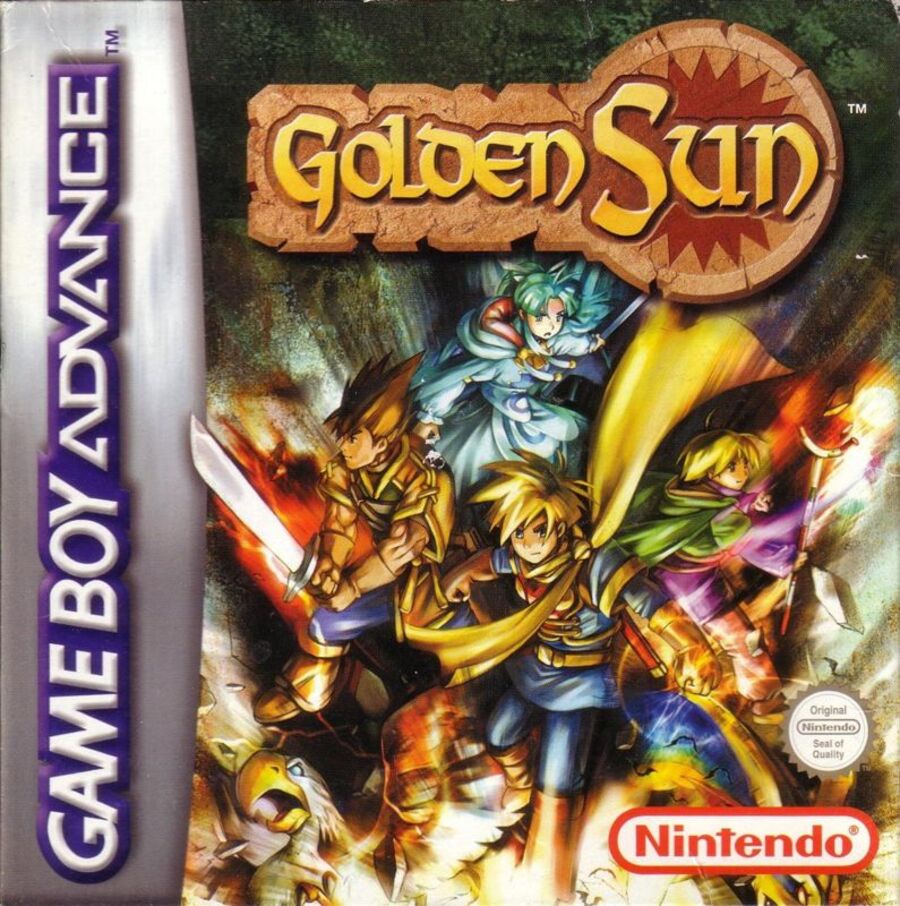
So, both designs in the running this week showcase the same set of characters, and they’re looking very heroic. With the western design, there’s nothing else here to take the focus away from the characters, with the logo itself nestled in at the top of the composition.
The colours used here are simply beautiful; it’s bold and striking, yet maintains an almost typical colour pallete for a fantasy game, with lots of brown, green, and, well… gold. Nice.
Japan

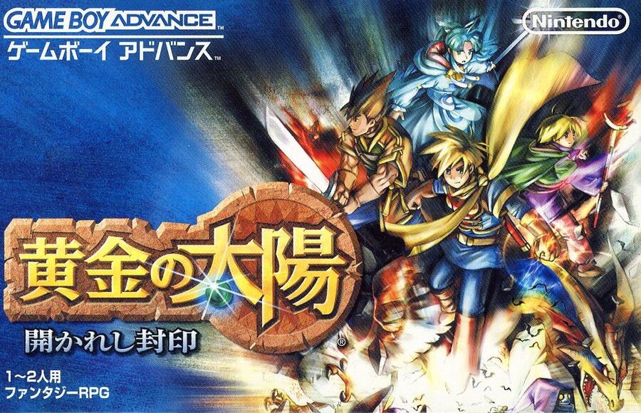
Japan’s design features the same set of characters, though admittedly there’s a bit more to look at here thanks to the ESRB and Nintendo logo’s blocking out one character on the western design. Boooo.
There’s also an awful lot of blue in this design, surrounding the characters and stretching out towards the left, allowing the Golden Sun logo to really pop out. It’s a great design, and we’re honestly a bit torn on this one.
Thanks for voting! We’ll see you next time for another round of the Box Art Brawl.


