Hello folks, and welcome to another edition of Box Art Brawl!
In last week’s battle, we took a look at Pokémon Stadium for the N64, pitting Europe and North America against Japan. It was a fairly close match, but Japan just about managed to take the crown with 58% of the vote.
So this time, we’re going back to the SNES to look at Capcom’s Mega Man 7. Launched in 1995, it was deemed a decent title in its own right, but many players considered it to be a bit of a step down when compared to the more stylised Mega Man X.
Europe and North American share very similar designs for this one, so they’re going to team up once again to go against Japan. Let’s get on with it!
Be sure to cast your votes in the poll below; but first, let’s check out the box art designs themselves.
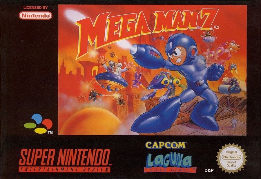
Europe / North America

The western design for Mega Man 7 features the Blue Bomber himself front and centre, striking a very eye-catcing pose. You’ve also got Dr. Wily and his goons in the background, while the logo itself curves nicely over the top of the image. We like the contrast here between the deep blue of Mega Man’s body and the ominous red background.
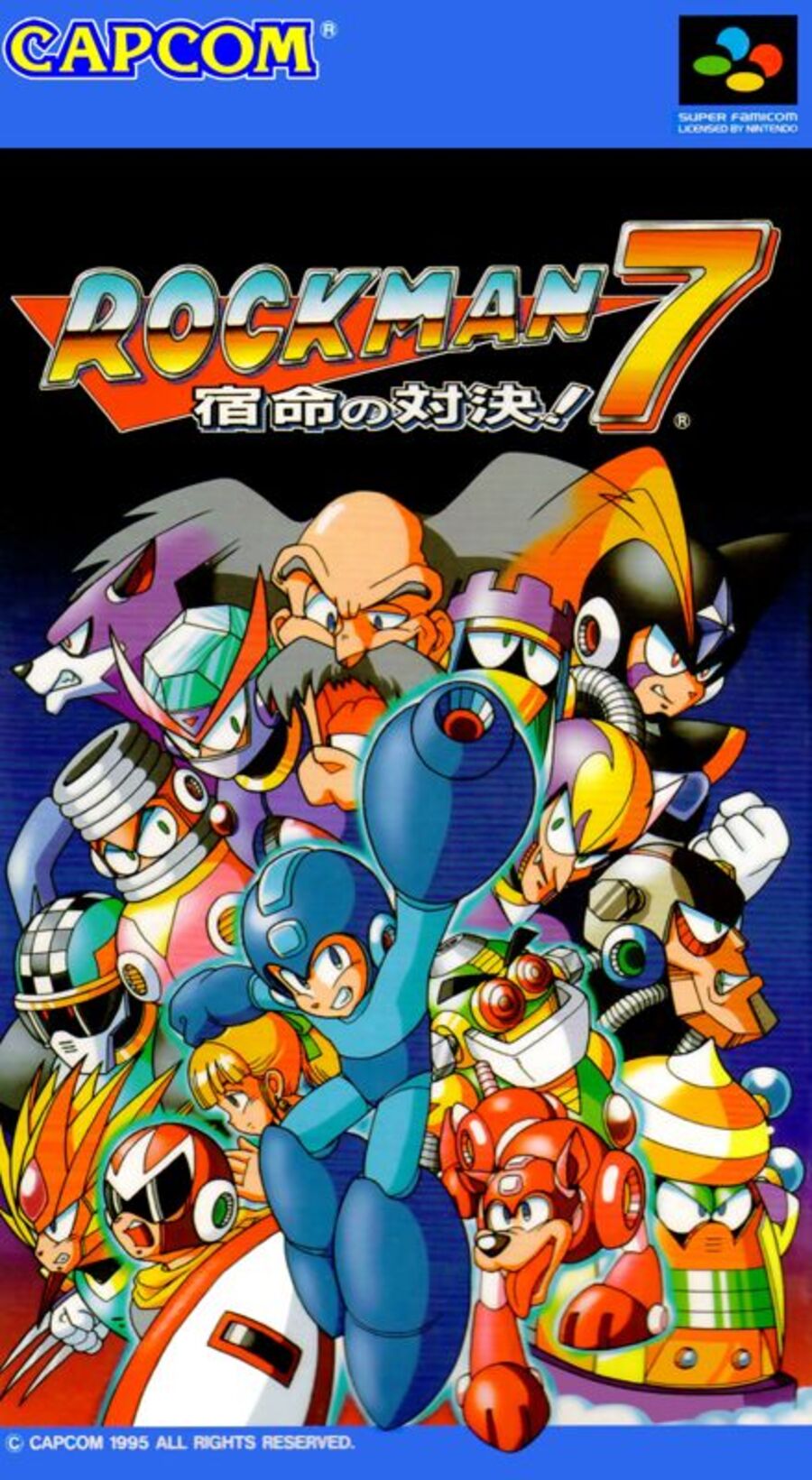
Japan

Japan’s design is very much a case of “everyone is here” for Mega Man. We can see the hero in the middle of the composition towards the bottom, with all the supporting cast, including Rush and Zero, lurking in the background. It definitely fills the image quite nicely, but we think it might be a tad ‘busy’… What do you think?
Thanks for voting! We’ll see you next time for another round of the Box Art Brawl.


