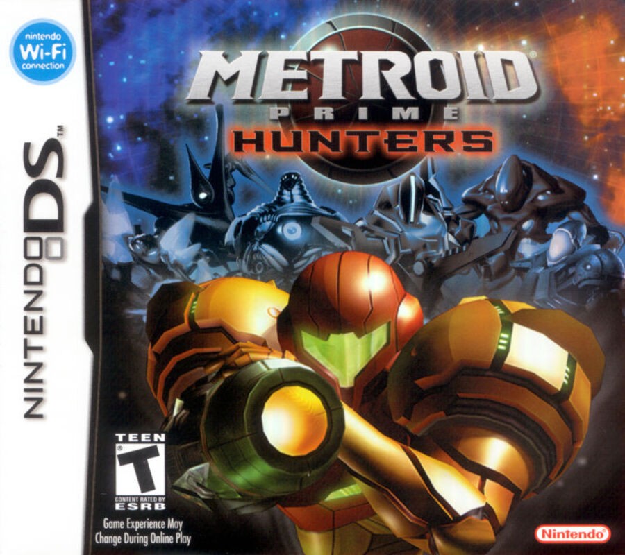
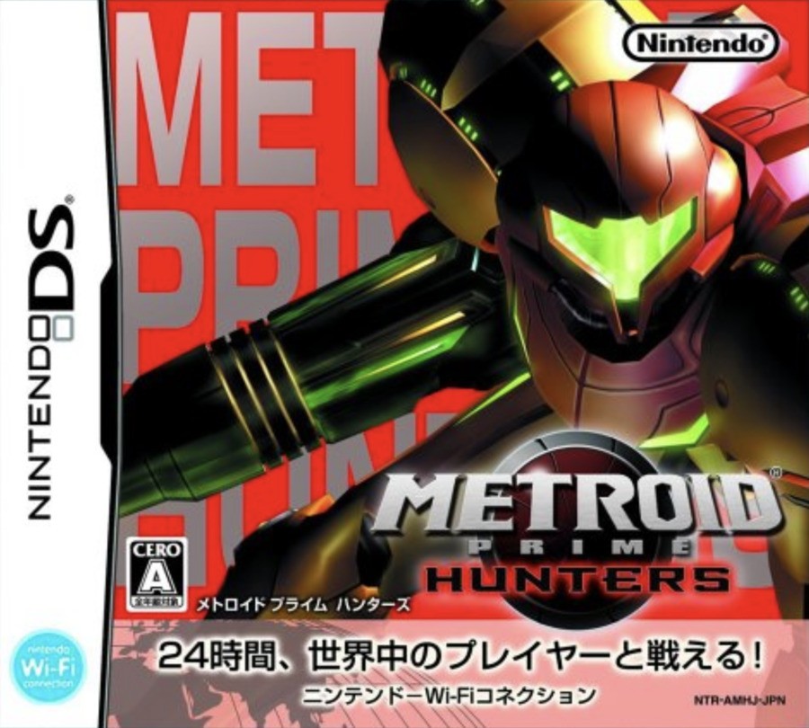
Be sure to cast your votes in the poll below; but first, let’s check out the box art designs themselves.
North America / Europe

The western design for Metroid Prime Hunters is pretty nice, overall. It features Samus herself in the immediate foreground in a rather striking pose, with a selection of the game’s other hunters in the background. There are a whole bunch of stars surrounding the characters and a pleasant colour gradiant from blue to orange; a tactic often used in movie and game posters.
We like this one a lot!
Japan

Japan’s approach to the design for Metroid Prime Hunters is a lot more abstract in nature, featuring Samus in another equally striking pose, but this time the other hunters are completely absent. Instead, we’ve got the game’s title in the background in a bold, silver typeface against a block of red colour. It’s certainly very eye-catching and when looking at the two variants side by side, this one is probably more likely to draw our gaze, even if it might not be quite as visually pleasing as the western approach.
Thanks for voting! We’ll see you next time for another round of the Box Art Brawl.


