Be sure to cast your votes in the poll below; but first, let’s check out the box art designs themselves.
North America

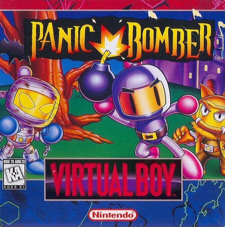
There’s a very light horror aesthetic with both box art variants for Panic Bomber, with each one featuring a castle in the background, a bat here and there, and characters based off classic horror creatures like mummies and werewolves. The North American design isn’t quite as busy as Japan’s, featuring just three characters and a single flying bat in the top left corner. It’s also bordered at the top and bottom, but is nevertheless an eye-catching display overall.
Japan

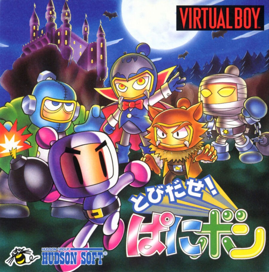
Japan’s design is, as mentioned above, busier in its composition, featuring a total of five characters with the viewpoint slightly further away, encompassing more of the background with it. There are no borders here either, which really allows the artwork itself to shine through. That said, the colourful logo in the bottom right might not be quite in keeping with the rest of the piece.
Thanks for voting! We’ll see you next time for another round of the Box Art Brawl.


