Be sure to cast your votes in the poll below; but first, let’s check out the box art designs themselves.
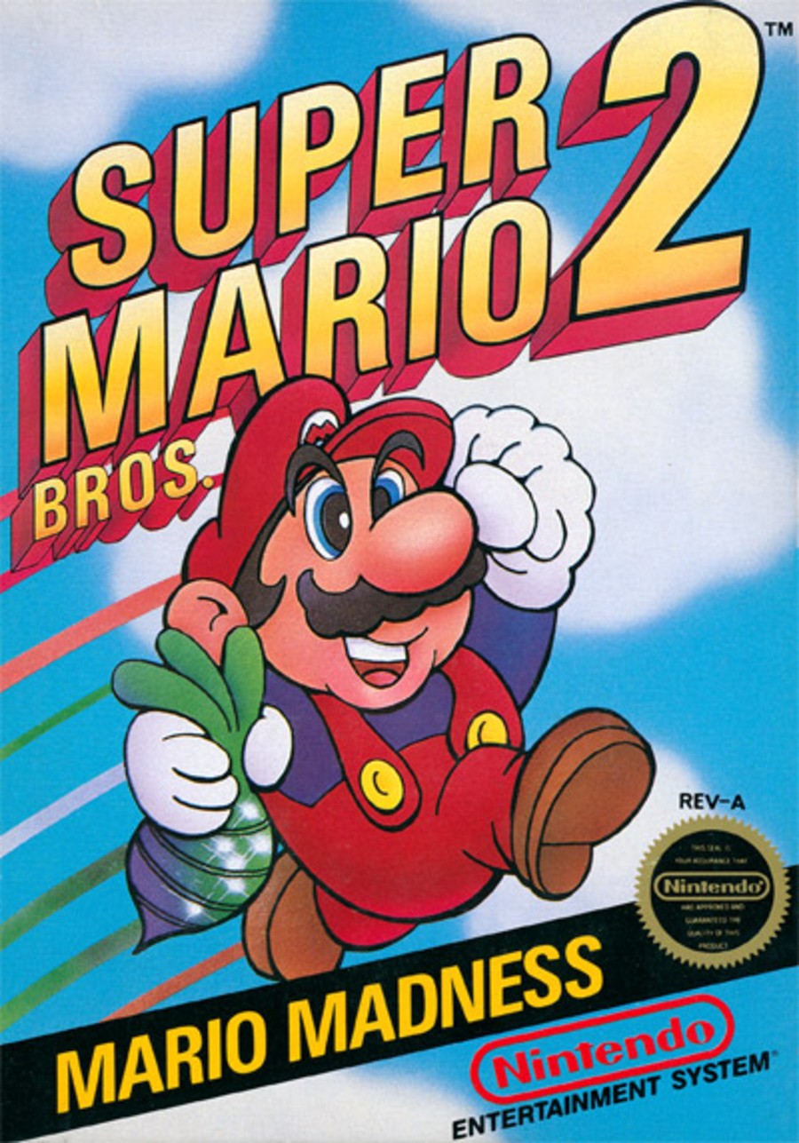
North America / Europe

The design for North America and Europe is reasonably straightforward, all told. It features the main man himself front and center, and looking quite jolly too, as a matter of fact. We like the simplicity here, and the logo at the top really stands out – there’s certainly no mistaking this game for anything else.
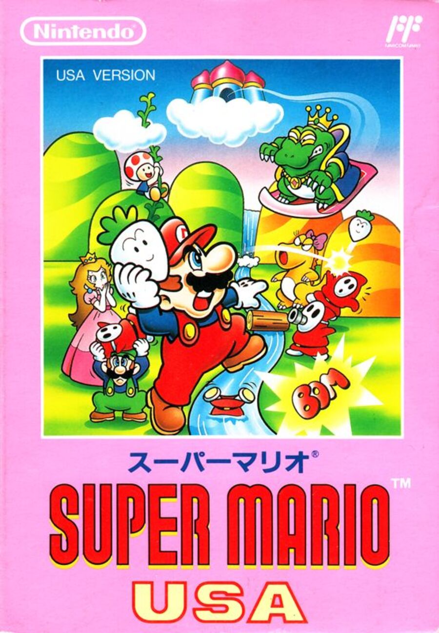
Japan

Japan’s design for Super Mario USA is a bit busier in its composition, featuring Mario getting ready to hurl a sprout at the multitude of enemies lying in wait. We’ve also got Luigi, Princess Peach, and Toad in the background, so it’s a really nice little gathering of all of our favourite Mario characters. We must admit, too, we’re really quite taken with the pink colour surrounding the artwork. It’s nice!
Thanks for voting! We’ll see you next time for another round of the Box Art Brawl.


