Introduction
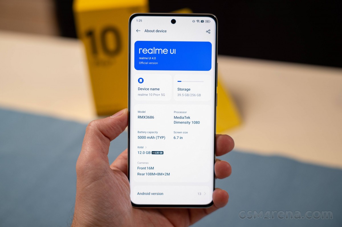
The Realme 10 Pro and 10 Pro+ are the first Realme phones to come out with Android 13. There is little you can see from the original Android interface as Realme uses its custom Realme UI, now in version 4.0.

It’s a good thing that the Realme UI 4.0 combines Android 13 and Realme UI optimizations, so you won’t be missing features of either one.
Android 13 highlight features include:
- Expanded customization options.
- Improved copy & paste.
- Improved media controls.
- Easier notification control with new permissions.
- Spatial Audio support, Bluetooth LE Audio support.
- Improved privacy.
- Integrated QR scanner.
Realme UI 4.0 also brings a slew of updates:
- New card-like layout, new simplistic icons.
- Improved Always-on Display with music controls.
- Dynamic widgets.
- Large folders.
- Auto Pixelate personal info on IM screenshots.
- Private Safe updated with Advanced Encryption Standard (AES).
And now, let’s take a closer look at this new software suite. We used the Realme 10 Pro+ as our guinea pig, as it is our most feature-rich phone with Realme UI for now. Some Realme phones may not get all the functionality we are about to explore, though.
Android 13 and Realme UI 4
Always-on screen is available, and it can show the usual content – clock, date, notifications icons, and battery, but you can opt-out of some of the information. The AOD has been expanded with Realme UI 4.0 with various themes, clocks, and even custom patterns to draw. The AOD now supports Spotify media controls, too.
The AOD can be power-saving (hide after a short motionless period), scheduled, or always on.
And here is a comparison with the Realme UI 3 Always-on Display – a simple option, though still one that gets the job done.
One of the new Always-on Display options is the Insight always-on display. It visualizes a timeline with data on every time you unlocked and used your phone throughout the day. It’s something of an addition to the Android Digital Wellbeing system of sorts, so you can track how much you use your phone.
And while we are talking about personalization, Realme UI 4.0 is flexible when it comes to this. There is an entire Style (and Wallpapers) page in Settings. You can change wallpapers (live and static), switch to different icon packs, different quick toggles icon shapes, change fonts, and choose completely different colors that will change the entire Realme UI look. Different AOD themes and fingerprint scanner animations are available, too. You can even turn on/off Edge Lighting, which is independent of the Always-On Display.
Realme UI 3 has a similar personalization page, but some of the options are arranged in a different way.
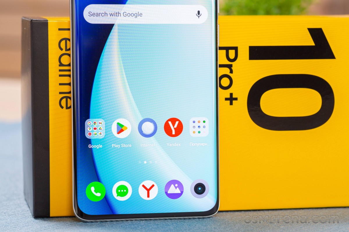
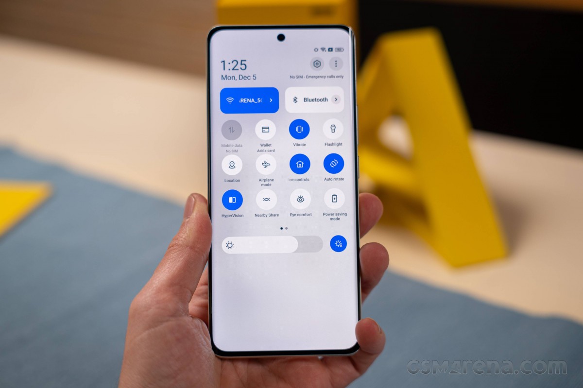
The launcher has no-nonsense homescreens, a simplistic and clean notification/toggles area, and an easy-to-use task switcher.

An App drawer is available, too, and it is as clutter-free as one could hope for. You can opt out of the app drawer if you prefer.
There is also an expanded Search page with dynamic widgets.


The new Search • The new Search • The old search
And this is Realme UI 3 on the Realme 10 with the old Google Search page.
The new launcher adds support for Large Folders and Dynamic Widgets. Any folder can be enlarged or shrunk quite easily – just tap and hold on it to enable/disable this function. Naturally, a Large folder can have multiple pages with apps. If you tap on a shortcut that’s visible in the folder – the app opens instantaneously. Or tap on the folder’s name to expand it.
Meanwhile, the new Realme widgets are not that many, but they refresh in real-time and always show relevant information.
Dark Mode is available, but unlike before, it does not offer three different dark styles. Instead, Realme UI 4.0 uses a combination of the previous three gray hues.


The old dark mode • the new Dark Mode
There are many powerful tools within the settings menu if you want full control over your Android OS. Or you can leave everything as is and enjoy a hassle-free Android experience optimized by Realme’s AI algorithms and machine learning.
You can also minimize an app to a floating window, now called a flexible window, because it’s super easy to resize it on the go. You can exchange files between the full-screen and flexible apps by drag and drop.
Flexible windows are available within the Task Switcher or the Sidebar. If an app is compatible, you can do either of these or use the familiar Split Screen.


Task Manager • Split screen • Flexible window • Flexible window
And speaking about the Sidebar, it’s quite familiar – a small visible mark on the edge of the screen that expands into a menu anytime you swipe on it. You can customize the actions for this menu and the app shortcuts that appear there.
The Smart Sidebar also offers background stream, meaning you can put YouTube, or any streaming app, in the background, and it will continue to play sound. This works when the screen is locked, too. Neat!
The Realme UI 4 (particularly as seen on the Realme 10 Pro+) also supports the RAM Expansion feature. As evident from the name, this feature lets you expand your smartphone’s RAM – albeit virtually – by using the phone’s internal storage. You can add from 4GB up to 12GB virtual RAM. This feature is active by default, and Realme has chosen 4GB for the default setting.
Oppo and, by extension, Realme have been known for the gestures it has implemented in Realme UI over the years. The screen-off gestures, for example, allow you to launch certain apps or the flashlight by drawing letters on a locked screen are here to stay.


Screen-off gestures and motion gestures
Realme also kept the Icon pull-down gesture. Swiping alongside the left or right edge of the screen crams icons at the bottom half of the screen so they can be easily reached with your thumb. The gesture is pretty reliable as well. By default, the swipe down gesture on the Home screen opens up the so-called global search, but you can always set the notification shade instead.
A Quick launch option is also available – you just tap on the fingerprint scanner (if your device comes with an optical reader, that is) and hold until icons for your pre-defined apps appear. Dragging your finger on one of them launches the app in question.


Icon pull-down gesture • Icon pull-down • Quick launch • Quick launch
Within the Realme lab section, you will find Dual-mode audio, Sleep Capsule, and Heart Rate Measurement (for phones with an under-display fingerprint reader). The Dual-mode audio allows you to connect both wired and wireless headphones and listen to music through both. Sleep Capsule is a night mode, which restricts specific apps. And the Heart Rate Measurement uses the optical fingerprint scanner to measure your heart rate. It may not be that accurate, though.
Previously, this Lab Page also contained DC dimming, but now this type of display behavior (DC or PWM) is handled by the software automatically.


Realme labs • Sleep Capsule • Heart Rate • The DC dimming from Realme UI 3 is no more
The multimedia apps such as Photos, Music, and Videos – are provided by Realme. There is also a revamped File Manager and even a Phone Manager app. This completes the non-Google app list.


Photos • Music • Videos • Phone Manager • Phone Manager • File Manager
As part of Android 13 comes an improved copy & paste functionality, which allows you to edit the text before pasting it elsewhere. See, when you copy something, a small clipboard window appears around the bottom – tap here, edit the text, and there is no need to copy it again, then just go and paste it. Neat!
And speaking of Android 13, you can find its integrated QR scanner as part of the Quick Toggles area. It leads to Google Lens, in case you were wondering.
Realme 4.0 UI also supports this cool auto-pixelate feature, which can blur/pixelate sensitive information when you take a screenshot in WhatsApp or Messenger, and you intend to share it with others. Unfortunately, it blurs only the name and pictures automatically, but won’t detect, say, mobile numbers.
We liked Realme UI 4.0. The interface is clutter-free and easy to use, and it feels great when it’s drawing at 90fps or at 120fp. Yet, it retains plenty of powerful tools should you choose to dig deeper and use them.
Final thoughts
We are fans of the new Realme UI 4 that’s based on Android 13. It feels somewhat faster, and more refined, and some of the reorganized settings now make more sense.

The expanded personalization options are much appreciated, the new widgets and folders are nice, too, and there is a lot more functionality to be discovered if you dig into Settings.
There are things that could have been done better – like widget stacks, a more intelligent Phone Manager, and a DeX-like or ReadyFor-like connectivity to a larger screen. Realme hasn’t set in stone a specific update policy either, so you never know how many updates you will get with your new Realme phone.
Realme UI, ColorOS and OxygenOS have been unified under the ColoroOS launcher, so if you find this Realme UI familiar, it’s because it’s a version of ColorOS 13, a rather identical one, we’d say. It is also similar to the latest OxygenOS 13, for better or worse. We hope this unification will eventually work as promised and we begin to reap the befits sooner rather than later.


