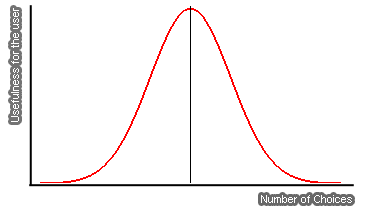
In economics there is a theory called “The Paradox of Choice”. It states that increasing the number of choices will improve the user experience, but only ultil a certain point. After that point the added choices will not only be indifferent to the user, but they might also become counterproductive.
A simple example: market researches found that individuals in a supermarket are 10 times more likely to make a purchase if they have to choose among six rather than among 20 flavors of jam.
Now, what do jam flavors have to do with your blog you might ask? Your blog, just like the supermarket shelf, presents many choices for the visitor. Every link, in fact, is a choice. When someone visits your blog he will need to choose among reading the home page, clicking on a single category, clicking on the advertising, contacting you and so on. If that is the case you need to make sure that you are not overwhelming your visitor with too many choices (links).
This approach applies to the whole blog design. If you place too many fields on the sidebar like “Latest Posts”, “Latests Comments”, “Top commentators”, “Blogroll”, Polls, Badges, Meta Data and so on the reader will probably get confused and avoid the sidebar. Similarly if you fill the bottom of your posts with “Related Entries”, advertising, subscription buttons, affiliate links and other extra information the user will just get lost and skip those sections altogether.
Do not get me wrong here, having those items on your blog are important, but not all of them bundled together otherwise they will lose the usefulness. Limit the set of choices for the reader and he will be much more likely to perform an action (i.e. click on a link).
