Introduction
The dust has settled, and we had a decent amount of time to get around all the new things One UI 5.0 has to offer. It has come a long way since the first iteration of Samsung’s new OS chapter after Samsung Experience. It’s easily one of our favorite custom Android skins, and the latest version is a big step forward in many aspects.
The first thing we noticed is how smoother it feels compared to One UI 4.0.
Secondly, it’s evident that the developers’ team worked hard on bringing a slew of new features to the already feature-packed OS. While most other OEMs introduced modest changes to their new Android overlays, Samsung’s changelog is a bit hard to cover from top to bottom. There are new additions to pretty much every category – from visual changes all the way down to some under-the-hood improvements.
In fact, One UI 5.0 seems like a lot bigger update than Android 13 itself. This leads us to our first stop in our One UI 5.0 review.
Android 13
Core Android features are sometimes neglected by other manufacturers when they update their proprietary OS versions, but Samsung diligently implements them in its One UI. This year’s intrinsic Android 13 features are few, and most focus on the visual aspect of Android’s Material Design looks. And since those are not applicable to Samsung’s own take on how Android should look, this leaves us with privacy and notification-focused improvements.
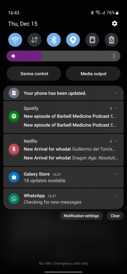
Once you install an app and launch it for the first time, the system will ask whether you want the app to send you notifications or keep them disabled by default. Notification-related controls are now easier to access and will always appear on top of the system menu. A direct shortcut to the app’s internal notification settings can be found at the bottom of the notification panel. More granular control over what types of notifications apps can send – badges, floating notifications and notification cards on the Lock screen.
Separate language control for each app is also available, which makes us wonder why such а basic feature wasn’t available before.
Privacy-wise, Android 13 now deletes clipboard data after a while because malicious apps were often exploiting the clipboard as users oftentimes copy sensitive data like phone numbers, emails, credit card numbers and even passwords.
One UI 5.0
Visual changes
As we already said earlier, perhaps one of the biggest improvements is the overall performance of the OS. Ever since the ancient TouchWiz, Samsung’s software is infamous for its rather sluggish performance. And even though One UI is a lot better than its predecessors, it’s still lagging behind its rivals in this regard. Literally and figuratively speaking. One UI 5.0 aims to fix that, and it does so up to a certain degree. Samsung has optimized animations and transitions that are sensibly faster and smoother. Everything feels a tad more natural.
Nevertheless, we could think of many other Android iterations that offer smoother and faster experience, so Samsung still has some work to do.
Other visual changes include better contrast, new app icons and illustrations across the system menus so that it’s easier to recognize apps and read text.
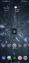
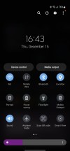
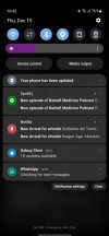
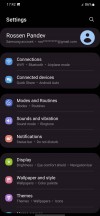
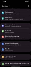
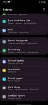
Home screen, notification shade, settings menu
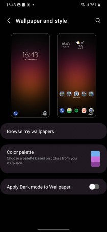
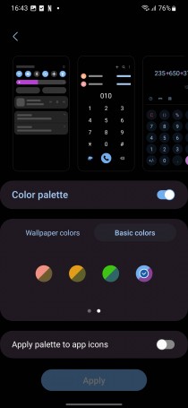
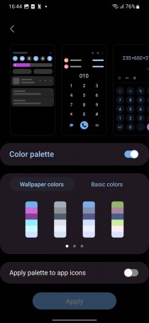
Once again, the accent color palette is automatically generated based on your wallpaper, but this time around, the system gives you a wider choice of color combinations and that palette can also be applied to app icons.
Customization options and wallpaper
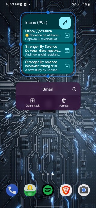
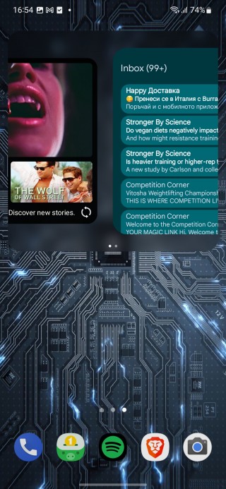
Widgets can now be stacked, and you can switch between stacked widgets with a simple swipe. Keep in mind that not all widgets support stacking, so app developers might have to get around that pretty soon.
Last but not least, the default dialer now picks animated backgrounds for each contact by default, so it’s kind of easier to see at a glance who’s calling. Unless, of course, you assign an AR emoji, a sticker or a photo of your choice.
New modes
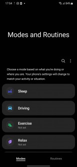
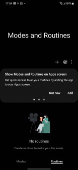
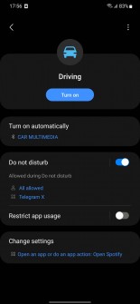
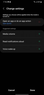
Samsung is introducing so-called Routines. You can choose a mode based on what you are doing right now and execute certain actions, change sound profiles, display settings, notifications, etc. For instance, the driving Routines profile can be set up to turn on DnD mode and launch Spotify automatically, for example. You can even trigger certain Routines with actions of your choice, such as turning on the hotspot or airplane mode.
Multitasking
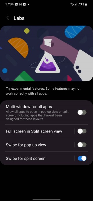
An easier way to launch two apps in split screen mode – a short swipe from the bottom edge of the display with two fingers. The same action can be done through the recent apps menu.
Split screen and Multi-window for all apps
Device connections
Although nothing particularly new in this category, Samsung does make connecting with nearby devices a tad easier. In the Connected devices sub-menu, you will find available devices for Smart View connection (read screen cast) or Samsun DeX, where available. Chromecasts are easier to discover and stream audio too. When you play sound from your phone, nearby Chromecasts will appear on the quick panel.
And once you cast the phone’s screen on a TV, for example, you can choose to hide your notifications so others won’t be able to read sensitive information from your phone.
Camera and gallery, photo and video editing
There aren’t any major changes to the camera performance or new modes, but there are a couple of neat new additions. For once, it’s easier to zoom in and out with one hand, Pro mode gains histogram, you can add a custom watermark or a date on each photo you take and the telephoto camera now supports Food mode.
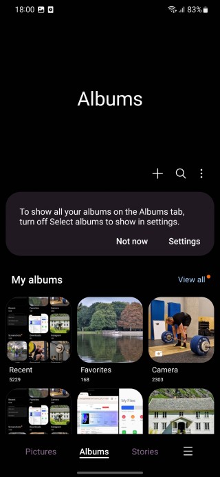
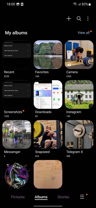
Samsung attempts to clear the clutter in the Gallery and the home screen there can now be customized. The goal is simple – remove the albums you use less frequently and leave the ones you do.
The built-in photo and video editors get a couple of new functionalities. You can create a sticker from any picture, there are more ways to edit GIFs now, draw perfect shapes on top of videos and photos using the pen tool, and you can find 60 new emoji stickers to add to your stills and clips.
Samsung keyboard
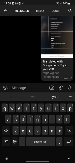
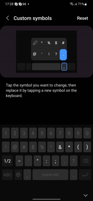
Aside from the extra emojis, the keyboard now inserts pre-defined facial expressions based on keyboard symbols. Oh, and you re-arrange the symbols on your keyboard as well as the ones that pop up next to the spacebar.
Smart text and image recognition
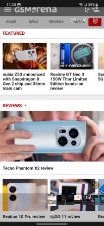
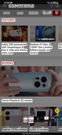
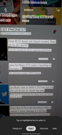
Google introduced something similar with Android 13 on the new Pixel phones. You can now extract text from an image, photo or even screenshot. The software is able to recognize certain text formats too. For instance, it suggests certain actions depending on whether it’s an email, phone number, website, etc.
There’s also a security functionality in place that looks for sensitive information such as credit cards, ID cards, passports, etc. And if you attempt to share it, a prompt will appear asking whether you are sure you want to continue with sharing this info.
Notifications
We’ve already touched upon the new notification features that come bundled with Android 13, but Samsung took the extra mile to offer some small improvements of its own. The first thing you’ll notice is that notification cards in the drop-down menu appear with a bigger icon of the app and a corresponding color. The text alignment in those notification cards is also optimized for better readability.
Miscellaneous
Some small new functionalities spread across the system include exceptions for DnD mode (apps of your choice won’t be affected by DnD), RAM Plus can be completely disabled through Device care, auto background optimization that keeps the system running smoothly, set up more timers simultaneously, expanded search in the My Files app, redesigned Digital Wellbeing, etc.


Digital Wellbeing, My files search, DnD exceptions and RAM Plus
Final thoughts
All in all, we like what One UI 5.0 has to offer. It’s a substantial improvement over 4.0 in many aspects, especially performance-wise, which we think is still the main shortcoming of Samsung’s custom Android overlay. The long changelog is also a nice surprise seeing how many of Samsung’s rivals have become complacent and offered somewhat boring major updates this year.
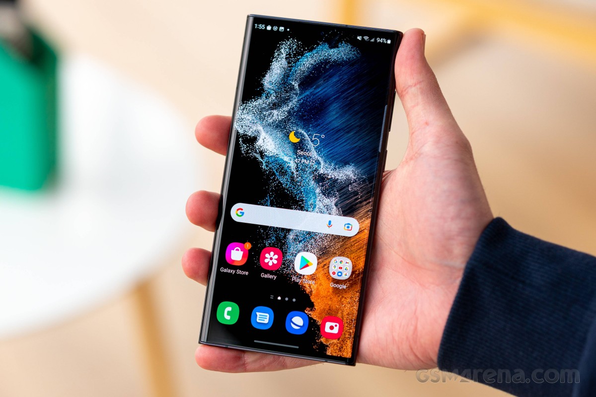
Even so, Samsung was careful with the changes not to change the overall feel of One UI completely. It’s still familiar but with better visuals and more functional than ever.
